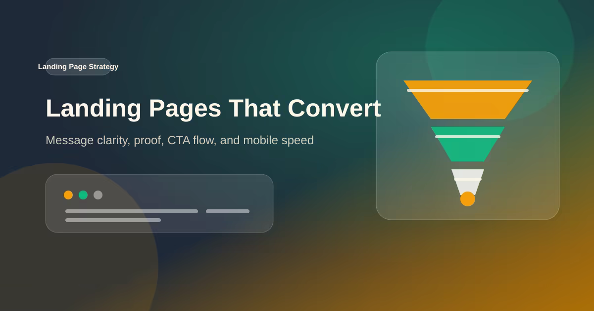
Why a Landing Page Is Critical for Your Website's Success
A focused landing page turns visitors into customers. Here's why every business needs one — and what separates a page that converts from one that bounces.
What a Landing Page Really Is
A landing page is a standalone web page built around a single goal — getting the visitor to take one specific action. Unlike a homepage, which acts as a hub and links everywhere, a landing page removes distractions and funnels attention toward one call to action (CTA): book a call, buy a product, or sign up.
Why Landing Pages Matter
Your homepage speaks to everyone. A landing page speaks to one person, about one offer, with one next step. That focus is exactly what makes it convert.
The core benefits:
- Higher conversion rates — fewer choices mean fewer reasons to leave
- Better ad ROI — paid traffic lands on a page built for that exact campaign
- Clearer messaging — one headline, one promise, one CTA
- Measurable results — you can attribute every visit to a specific outcome
- Faster decisions — visitors know within seconds what you offer and what to do next
Landing Page vs Homepage
It's a common confusion. A homepage introduces your business and lets people explore. A landing page is built to convert. Sending ad traffic to a homepage is like walking a customer into a mall when they came to buy one thing — every extra link is an exit.
What Makes a Landing Page Convert
Good design alone isn't enough. A high-converting landing page is engineered around the visitor's decision:
- One clear CTA — repeated, not competing with other offers
- A value proposition above the fold — what you offer and for whom, instantly
- Social proof — testimonials, results, and trust signals
- Fast load speed — visitors leave if it takes more than a few seconds
- Mobile-first layout — most of your traffic arrives on a phone
- A logical flow — problem, solution, proof, action
Common Mistakes to Avoid
The fastest way to kill conversions is to overload the page. Too many CTAs, walls of text, slow images, and vague headlines all push visitors away. Every element should earn its place by moving the visitor one step closer to the action.
Conclusion
A landing page isn't just another page on your site — it's the bridge between traffic and results. Whether you run ads, share links on social media, or pitch a specific service, a focused landing page makes sure that attention turns into action. Build it with one goal in mind, and the conversions follow.
Field Notes From Conversion-Focused Website Builds
A landing page is not just a prettier homepage. It is a decision path. When I build one for a service business, I start by naming the visitor, the offer, the objection, and the desired action. The design comes after that. If the page cannot answer why this offer, why now, why trust this provider, and what to do next, better visuals will not fix the conversion problem.
The strongest landing pages usually have fewer sections than clients expect, but each section works harder. The hero clarifies the promise. The problem section makes the visitor feel understood. The service section explains the mechanism. Proof reduces risk. FAQ handles hesitation. The CTA appears after meaningful context, not only at the top and bottom.
Performance matters because paid and social traffic is impatient. Heavy animation, oversized images, and vague copy all create friction before the visitor has formed trust. A good landing page should load quickly, read clearly on a phone, and make the next step obvious even for someone who is distracted. That practical clarity is what turns attention into leads.
Implementation Checklist I Use Before Publishing
Before I publish a technical or marketing page, I run through a small checklist that connects engineering quality with business outcomes. The page must have one clear reader, one primary action, and enough supporting detail to answer obvious objections. For a technical article, that means examples, tradeoffs, and implementation notes. For a service page, it means deliverables, proof, timeline, and the next step.
I also check the page from a performance angle. Images need explicit dimensions or reserved aspect ratios so the layout does not jump. Below-the-fold media should lazy-load. Client-side JavaScript should be limited to the interactions that truly need it. If a page is mostly text, cards, and images, it should not ship a large animation runtime just to fade in content that could have appeared immediately.
Metadata is part of the content, not a final decoration. Titles should be specific enough to be useful in search results and short enough to avoid truncation. Descriptions should summarize the page with concrete terms, not repeat the title. When a page exists in English and Indonesian, I avoid duplicate title values by giving each version its own search snippet and language-specific framing.
Finally, I look for visible trust signals. Readers should know who wrote the page, when it was updated, and why the author has enough context to make the recommendation. This is especially important for portfolio, service, and technical pages because the site is selling judgment as much as code. A byline, project evidence, external profiles, and clear update dates make the page easier to trust and easier for search systems to interpret.
Localization, Proof, and Maintenance Notes
For bilingual websites, I avoid treating translation as a copy-paste task. The English page and Indonesian page can discuss the same subject, but each version still needs its own search title, description, and natural phrasing. This prevents duplicate snippets, gives search engines clearer language signals, and makes the page feel written for the reader rather than mechanically mirrored.
I also keep a small maintenance log for important pages. When a framework changes, a package releases a new major version, or a business offer changes, the page should be reviewed instead of left frozen. The update does not always need a rewrite. Sometimes it is enough to adjust a section, refresh examples, add an implementation note, or clarify a tradeoff that became more important after launch.
The last review is usefulness. If a paragraph only exists to make the article longer, it should be cut or replaced with a concrete example. Good SEO content is not padded; it is specific. It explains the decision, shows the constraint, and gives the reader a next action they can apply to a real project.
Questions I Ask During Review
I ask whether the page would still be useful to someone who skips the introduction and lands in the middle from search. Each major section should stand on its own with a clear heading, a direct answer, and enough surrounding context to prevent misinterpretation. This makes the article easier to scan and also helps individual passages work as citation candidates in AI search results.
I also check whether the recommendation would change for a smaller business, a larger product team, or a maintenance project. If the answer is yes, the article should name that difference instead of presenting one universal rule. Real projects have budgets, deadlines, existing code, brand constraints, and team skill levels. Good advice respects those constraints and explains when a simpler option is the better engineering choice.
That is the standard I use for client-facing content too. A page should not only describe what can be built; it should help the reader decide what should be built now, what can wait, and what risk the decision reduces.
When the answer is uncertain, I prefer naming the assumption openly. Clear assumptions make future updates easier and help readers adapt the recommendation to their own project instead of copying it blindly.
Practical review points
- Can a reader understand the page goal within the first screen?
- Does every section move the reader toward clarity, proof, or action?
- Are images sized, compressed, and relevant to the real offer or example?
- Is the page still useful without animation, hover states, or JavaScript-only behavior?
- Would the metadata make sense if it appeared alone in a search result?
This checklist keeps content from becoming thin filler. The goal is not to hit a word count for its own sake. The goal is to give enough context that a serious reader can make a better decision: what to build, what to avoid, and what tradeoffs matter for their situation.