Advanced Tailwind CSS Techniques
Discover advanced Tailwind CSS patterns, custom utilities, and optimization strategies for production applications.
Custom Utilities
Tailwind CSS allows you to extend its utility classes with your own custom utilities, making it easy to maintain consistent styling across your application.
Component Patterns
Learn how to create reusable component patterns using Tailwind's @apply directive and CSS variables for dynamic theming.
Advanced Techniques:
- Custom color palettes with CSS variables
- Responsive design with custom breakpoints
- Dark mode implementation
- Animation and transition utilities
Optimization Strategies
Use PurgeCSS to remove unused styles in production, configure JIT mode for faster builds, and leverage Tailwind's built-in optimization features.
Plugin Development
Create custom Tailwind plugins to extend functionality and share reusable utilities across projects.
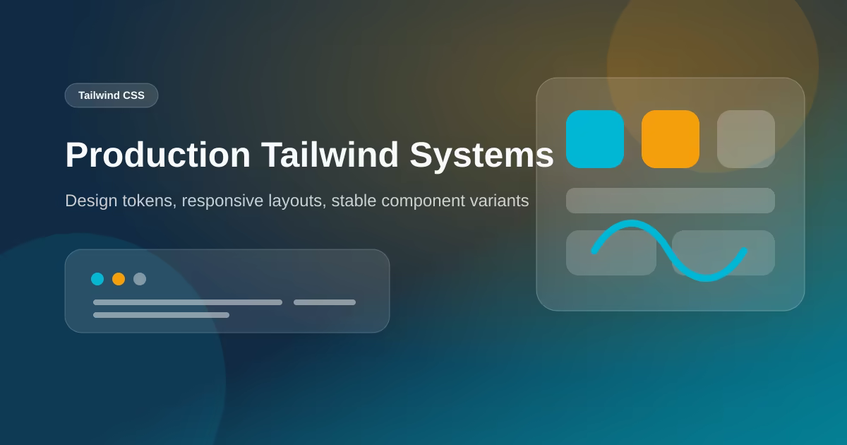
Field Notes From Tailwind Design Systems
Tailwind works best when the team treats utilities as a vocabulary, not as random decoration. The most maintainable projects define repeated layout patterns, spacing rhythm, color tokens, and component variants early. Without that discipline, class names grow long because every card, button, and section solves the same problem differently. The result can still look consistent in screenshots while becoming hard to maintain in code.
For production sites I prefer small component APIs backed by Tailwind utilities and CSS variables. A button should expose size and variant. A card should have predictable padding and border behavior. A page section should have consistent max width and vertical rhythm. When those decisions are centralized, adding a new service page or case study becomes faster and less risky.
Advanced Tailwind is also about restraint. It is easy to add gradients, shadows, transforms, and motion everywhere because the utilities are available. The better question is whether the visual treatment helps the user scan, compare, and act. On service and portfolio pages, the best UI is often quiet: clear hierarchy, stable spacing, readable copy, and obvious calls to action.
Implementation Checklist I Use Before Publishing
Before I publish a technical or marketing page, I run through a small checklist that connects engineering quality with business outcomes. The page must have one clear reader, one primary action, and enough supporting detail to answer obvious objections. For a technical article, that means examples, tradeoffs, and implementation notes. For a service page, it means deliverables, proof, timeline, and the next step.
I also check the page from a performance angle. Images need explicit dimensions or reserved aspect ratios so the layout does not jump. Below-the-fold media should lazy-load. Client-side JavaScript should be limited to the interactions that truly need it. If a page is mostly text, cards, and images, it should not ship a large animation runtime just to fade in content that could have appeared immediately.
Metadata is part of the content, not a final decoration. Titles should be specific enough to be useful in search results and short enough to avoid truncation. Descriptions should summarize the page with concrete terms, not repeat the title. When a page exists in English and Indonesian, I avoid duplicate title values by giving each version its own search snippet and language-specific framing.
Finally, I look for visible trust signals. Readers should know who wrote the page, when it was updated, and why the author has enough context to make the recommendation. This is especially important for portfolio, service, and technical pages because the site is selling judgment as much as code. A byline, project evidence, external profiles, and clear update dates make the page easier to trust and easier for search systems to interpret.
Localization, Proof, and Maintenance Notes
For bilingual websites, I avoid treating translation as a copy-paste task. The English page and Indonesian page can discuss the same subject, but each version still needs its own search title, description, and natural phrasing. This prevents duplicate snippets, gives search engines clearer language signals, and makes the page feel written for the reader rather than mechanically mirrored.
I also keep a small maintenance log for important pages. When a framework changes, a package releases a new major version, or a business offer changes, the page should be reviewed instead of left frozen. The update does not always need a rewrite. Sometimes it is enough to adjust a section, refresh examples, add an implementation note, or clarify a tradeoff that became more important after launch.
The last review is usefulness. If a paragraph only exists to make the article longer, it should be cut or replaced with a concrete example. Good SEO content is not padded; it is specific. It explains the decision, shows the constraint, and gives the reader a next action they can apply to a real project.
Questions I Ask During Review
I ask whether the page would still be useful to someone who skips the introduction and lands in the middle from search. Each major section should stand on its own with a clear heading, a direct answer, and enough surrounding context to prevent misinterpretation. This makes the article easier to scan and also helps individual passages work as citation candidates in AI search results.
I also check whether the recommendation would change for a smaller business, a larger product team, or a maintenance project. If the answer is yes, the article should name that difference instead of presenting one universal rule. Real projects have budgets, deadlines, existing code, brand constraints, and team skill levels. Good advice respects those constraints and explains when a simpler option is the better engineering choice.
That is the standard I use for client-facing content too. A page should not only describe what can be built; it should help the reader decide what should be built now, what can wait, and what risk the decision reduces.
When the answer is uncertain, I prefer naming the assumption openly. Clear assumptions make future updates easier and help readers adapt the recommendation to their own project instead of copying it blindly.
Practical review points
- Can a reader understand the page goal within the first screen?
- Does every section move the reader toward clarity, proof, or action?
- Are images sized, compressed, and relevant to the real offer or example?
- Is the page still useful without animation, hover states, or JavaScript-only behavior?
- Would the metadata make sense if it appeared alone in a search result?
This checklist keeps content from becoming thin filler. The goal is not to hit a word count for its own sake. The goal is to give enough context that a serious reader can make a better decision: what to build, what to avoid, and what tradeoffs matter for their situation.